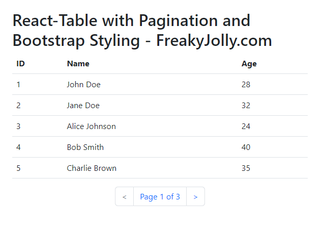
In this article, we will discuss how to create a reusable table component using React-Table with pagination and Bootstrap styling.
Creating reusable components makes web applications efficient and maintainable. We will also demonstrate how to pass sample data from a parent component to the table component.
React-Table is a lightweight and flexible library that provides a simple and easy-to-use solution for creating tables in React applications. It has many built-in features like pagination, sorting and filter capabilities, it is an excellent choice for developers to create complex table components easily.
[lwptoc]
Setup the Project
First, we need to set up a new React project. We will use the create-react-app command-line tool to create our project. Run the following command in your terminal:
npx create-react-app react-table-pagination
After the project is created, navigate to the project directory:
cd react-table-pagination
Installing Dependencies
Next, we will install the necessary dependencies:
react-table: for creating the table componentreact-bootstrapandbootstrap: for styling the table component
Run the following command to install these dependencies:
npm install react-table react-bootstrap bootstrap
Creating the Table Component
Create a new file called CustomTable.js in the src directory and add the following code:
import React from "react";
import { useTable, usePagination } from "react-table";

const CustomTable = ({ columns, data }) => {
  const {
    getTableProps,
    getTableBodyProps,
    headerGroups,
    prepareRow,
    page,
    canPreviousPage,
    canNextPage,
    nextPage,
    previousPage,
    state: { pageIndex },
  } = useTable(
    {
      columns,
      data,
      initialState: { pageIndex: 0, pageSize: 5 },
    },
    usePagination
  );

  // Table rendering
  return (
    <>
      <table {...getTableProps()} className="table">
        <thead>
          {headerGroups.map((headerGroup) => (
            <tr {...headerGroup.getHeaderGroupProps()}>
              {headerGroup.headers.map((column) => (
                <th {...column.getHeaderProps()}>{column.render("Header")}</th>
              ))}
            </tr>
          ))}
        </thead>
        <tbody {...getTableBodyProps()}>
          {page.map((row) => {
            prepareRow(row);
            return (
              <tr {...row.getRowProps()}>
                {row.cells.map((cell) => (
                  <td {...cell.getCellProps()}>{cell.render("Cell")}</td>
                ))}
              </tr>
            );
          })}
        </tbody>
      </table>
      <div className="d-flex justify-content-center">
        <ul className="pagination">
          <li className={`page-item ${!canPreviousPage && "disabled"}`}>
            <button
              className="page-link"
              onClick={() => previousPage()}
              disabled={!canPreviousPage}
            >
              {"<"}
            </button>
          </li>
          <li className="page-item">
            <span className="page-link">
              Page {pageIndex + 1} of {Math.ceil(data.length / 5)}
            </span>
          </li>
          <li className={`page-item ${!canNextPage && "disabled"}`}>
            <button
              className="page-link"
              onClick={() => nextPage()}
              disabled={!canNextPage}
            >
              {">"}
            </button>
          </li>
        </ul>
      </div>
    </>
  );
};

export default CustomTable;
Adding Pagination
In the CustomTable component, we are using the usePagination plugin provided by React-Table to enable pagination functionality. We have also added buttons for navigating between pages and displaying the current page number.
Integrating Bootstrap
To apply Bootstrap styling, we have added the className="table" attribute to the <table> element. Make sure to import Bootstrap in your src/index.js file:
import 'bootstrap/dist/css/bootstrap.min.css';
Adding Sample Data
Create a new file called sampleData.js in the src directory and add the following sample data:
export const COLUMNS = [
  {
    Header: "ID",
    accessor: "id",
  },
  {
    Header: "Name",
    accessor: "name",
  },
  {
    Header: "Age",
    accessor: "age",
  },
];

export const DATA = [
  { id: 1, name: "John Doe", age: 28 },
  { id: 2, name: "Jane Doe", age: 32 },
  { id: 3, name: "Alice Johnson", age: 24 },
  { id: 4, name: "Bob Smith", age: 40 },
  { id: 5, name: "Charlie Brown", age: 35 },
  { id: 6, name: "David White", age: 30 },
  { id: 7, name: "Eva Green", age: 29 },
  { id: 8, name: "Fiona Black", age: 22 },
  { id: 9, name: "George Grey", age: 28 },
  { id: 10, name: "Hannah Blue", age: 25 },
  { id: 11, name: "Ivan Red", age: 31 },
  { id: 12, name: "Julia Yellow", age: 27 },
  { id: 13, name: "Kevin Purple", age: 38 },
  { id: 14, name: "Linda Orange", age: 33 },
  { id: 15, name: "Michael Pink", age: 29 },
];
Integrating the Table Component into the Parent Component
Update your src/App.js file to include the CustomTable.js:
import React from "react";
import CustomTable from "./CustomTable";
import { COLUMNS, DATA } from "./sampleData";

const App = () => {
  return (
    <div className="App">
      <h1>
        React-Table with Pagination and Bootstrap Styling - FreakyJolly.com
      </h1>
      <CustomTable columns={COLUMNS} data={DATA} />
    </div>
  );
};

export default App;
Run the Application
Start your development server by running the following command:
npm start
Navigate to http://localhost:3000 in your browser to view the table component with pagination and Bootstrap styling.
FAQs
Can I use other CSS frameworks instead of Bootstrap? Yes, you can use any CSS framework of your choice. Simply replace the Bootstrap classes with the appropriate classes from your chosen framework.
How can I customize the pagination? You can customize the pagination by modifying the usePagination options or by creating your own custom pagination component.
Can I add sorting functionality to the table? Yes, React-Table supports sorting functionality out-of-the-box. You can enable it by adding the useSortBy plugin to your useTable configuration.
Is it possible to add filtering functionality to the table component? Yes, you can add filtering functionality using the useFilters plugin provided by React-Table.
Can I use this reusable table component with remote data sources? Absolutely! You can fetch data from a remote API and pass it as a prop to the CustomTable component. You may need to adjust the pagination configuration to accommodate server-side pagination.
Conclusion
In this article, we have successfully created a reusable table component using React-Table with pagination and Bootstrap styling. By following these steps, you can create similar components to suit your application’s requirements.

