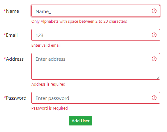
In this Angular tutorial, we’ll create a form using the Reactive Form approach and show validation messages if the user enters an invalid value. Form Controls will be used with Bootstrap styling to show error messages.
Angular forms can be easily created by using the Template-driven or Reactive form approach. In this tutorial, we are going to build a Reactive Form using FormControl having few Input Form fields.
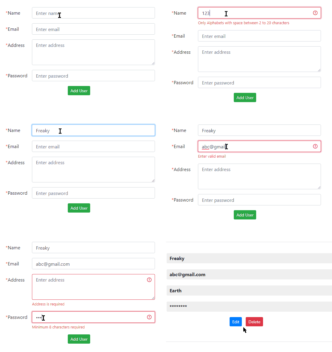
The styling of the form will use Bootstrap. The validation messages will be shown on each form control in the template HTML when the user enters invalid or doesn’t fill any value for required fields or tries to submit the incomplete form.
The validation messages will be shown if the user focuses on a field but doesn’t enter a value or enter the wrong value.
Let’s start building…
[lwptoc]
Using Bootstrap Style
To quickly use bootstrap style inside the application, just include the bootstrap.css file in the HEAD section of the index.html file at Angular project root.
<link rel="stylesheet" href="https://stackpath.bootstrapcdn.com/bootstrap/4.5.2/css/bootstrap.min.css">
Adding Template HTML
In the App component template, we’ll add a form with four Input control fields, Name, Email, Address and Password.
The <form> will have [formGroup]="addUserForm" and (ngSubmit) event handler.
Then add each form control field for Name, Email, Address, and Password.
<form [formGroup]="addUserForm" (ngSubmit)="submitUser()">

    <!-- Name control -->
    <div class="form-group row">
        <label class="col-sm-2 col-form-label">*Name</label>
        <div class="col-sm-10">

            <input type="text" formControlName="name" class="form-control" placeholder="Enter name">

        </div>
    </div>

    <!-- Email control -->
    <div class="form-group row">
        <label class="col-sm-2 col-form-label">*Email</label>
        <div class="col-sm-10">

            <input type="text" formControlName="email" class="form-control" placeholder="Enter email">

        </div>
    </div>

    <!-- Address control -->
    <div class="form-group row">
        <label class="col-sm-2 col-form-label">*Address</label>
        <div class="col-sm-10">

            <textarea class="form-control" formControlName="address" placeholder="Enter address" rows="3"></textarea>

        </div>
    </div>

    <!-- Password control -->
    <div class="form-group row">
        <label class="col-sm-2 col-form-label">*Password</label>
        <div class="col-sm-10">

            <input type="password" formControlName="password" class="form-control" placeholder="Enter password">

        </div>
    </div>

    <div class="form-group text-center">
        <button type="submit" class="btn btn-success btn-sm">Add User</button>
    </div>

</form>
Each control is having the formControlName to get value. We haven’t implemented the elements required to show validation messages yet.
Handling the Form in Class Component
In the AddUserComponent, initialize the addUserForm with FormGroup
addUserForm: FormGroup;A variable is used as a flag to check when a form is submitted
isFormSubmitted = false;In the ngOnInit() hook, assign FormControl for each form field
ngOnInit(){

    this.addUserForm = this.formBuilder.group({
      name: [ '' ],
      email: [''],
      address: [''],
      password: ['']
    });

}
Each field is having empty value on start.
Add a submitUser() method to handle form submit.
submitUser() {

    // Set flag to true
    this.isFormSubmitted = true;

    // Form field values
    console.log(this.addUserForm.value);
}
Now we have a working form, in next section, we’ll implement the validation part.
Update FormBuilder Group for Validation
To add validation, first, update the formBuilder‘s group method configuration. Each FormControl will have a Validation array.
ngOnInit(): void {

    // Patterns
    const PAT_NAME = "^[a-zA-Z ]{2,20}$";
    const PAT_EMAIL = "^[a-zA-Z0-9._%+-]+@[a-zA-Z0-9.-]+[.][a-zA-Z]{2,4}$";

    this.addUserForm = this.formBuilder.group({
      name: ['', [Validators.required, Validators.pattern(PAT_NAME)]],
      email: ['', [Validators.required, Validators.pattern(PAT_EMAIL)]],
      address: ['', Validators.required],
      password: ['', [Validators.required, Validators.minLength(8)]]
    });

}
Above, with each control, we have an Array of Validators required. For Name & Email, we have required and pattern validation checks. The password field must be required and have a minimum of 8 characters.
Update Form Template
To show error messages we will add a class ‘is-invalid’ for each control only if :
The Form is submitted & field is Invalid. OR The field is not pristine (touched by user) and invalid. So there two cases when the form filed will be red to indicate the error.
After each form filed we’ll add an error block to show error messages.
<!-- User form for Add/ Edit -->
        <form [formGroup]="addUserForm" (ngSubmit)="submitUser()">

            <!-- Name control -->
            <div class="form-group row">
                <label class="col-sm-2 col-form-label"><span class="required-asterisk">*</span>Name</label>
                <div class="col-sm-10">
                    <!-- Alerts user when control is interacted or form is submitted about errors-->
                    <input type="text" formControlName="name" class="form-control" placeholder="Enter name"
                        [ngClass]="{ 'is-invalid': (isFormSubmitted && addUserForm.controls.name.errors) || (!addUserForm.controls.name.pristine && addUserForm.controls.name.invalid) }">

                    <!-- Validation messages -->
                    <div class="invalid-feedback"
                        *ngIf="(isFormSubmitted && addUserForm.controls.name.errors) || (!addUserForm.controls.name.pristine && addUserForm.controls.name.invalid)">
                        <div *ngIf="addUserForm.controls.name.errors.required">Name is required</div>
                        <div *ngIf="addUserForm.controls.name.errors.pattern">Only Alphabets with space
                            between 2 to
                            20
                            characters</div>

                    </div>
                </div>
            </div>

            <!-- Email control -->
            <div class="form-group row">
                <label class="col-sm-2 col-form-label"><span class="required-asterisk">*</span>Email</label>
                <div class="col-sm-10">

                    <input type="text" formControlName="email" class="form-control" placeholder="Enter email"
                        [ngClass]="{ 'is-invalid': (isFormSubmitted && addUserForm.controls.email.errors) || (!addUserForm.controls.email.pristine && addUserForm.controls.email.invalid) }">

                    <!-- Validation messages -->
                    <div class="invalid-feedback"
                        *ngIf="(isFormSubmitted && addUserForm.controls.email.errors) || (!addUserForm.controls.email.pristine && addUserForm.controls.email.invalid)">
                        <div *ngIf="addUserForm.controls.email.errors.required">Email is required</div>
                        <div *ngIf="addUserForm.controls.email.errors.pattern">Enter valid email</div>

                    </div>
                </div>
            </div>

            <!-- Address control -->
            <div class="form-group row">
                <label class="col-sm-2 col-form-label"><span class="required-asterisk">*</span>Address</label>
                <div class="col-sm-10">

                    <textarea class="form-control" formControlName="address" placeholder="Enter address" rows="3"
                        [ngClass]="{ 'is-invalid': (isFormSubmitted && addUserForm.controls.address.errors) || (!addUserForm.controls.address.pristine && addUserForm.controls.address.invalid) }"></textarea>

                    <!-- Validation messages -->
                    <div class="invalid-feedback"
                        *ngIf="(isFormSubmitted && addUserForm.controls.address.errors) || (!addUserForm.controls.address.pristine && addUserForm.controls.address.invalid)">
                        <div *ngIf="addUserForm.controls.address.errors.required">Address is required</div>

                    </div>
                </div>
            </div>

            <!-- Password control -->
            <div class="form-group row">
                <label class="col-sm-2 col-form-label"><span class="required-asterisk">*</span>Password</label>
                <div class="col-sm-10">

                    <input type="password" formControlName="password" class="form-control" placeholder="Enter password"
                        [ngClass]="{ 'is-invalid': (isFormSubmitted && addUserForm.controls.password.errors) || (!addUserForm.controls.password.pristine && addUserForm.controls.password.invalid) }">

                    <!-- Validation messages -->
                    <div class="invalid-feedback"
                        *ngIf="(isFormSubmitted && addUserForm.controls.password.errors) || (!addUserForm.controls.password.pristine && addUserForm.controls.password.invalid)">
                        <div *ngIf="addUserForm.controls.password.errors.required">Password is required</div>
                        <div *ngIf="addUserForm.controls.password.errors.minlength">Minimum 8 characters required</div>
                    </div>
                </div>
            </div>

            <div class="form-group text-center">
                <!-- Dynamic text of submit button -->
                <button type="submit" class="btn btn-success btn-sm">{{urlParams?'Update':'Add'}} User</button>

                <!-- Cancel button is shown when User is in edit mode -->
                <a type="submit" class="btn btn-danger btn-sm" (click)="closeModal('close')"
                    *ngIf="urlParams">Cancel</a>
            </div>

        </form>
We have error messages for each validation criteria.
That’s it for Angular Reactive form validation.
Final Code for Component Class
The component class will finally have the following code with the updated submitUser() method.
import { Component, OnInit } from '@angular/core';
import { FormBuilder, FormGroup, Validators } from '@angular/forms';

@Component({
  selector: 'app-add-user',
  templateUrl: './add-user.component.html',
  styleUrls: ['./add-user.component.scss']
})
export class AddUserComponent implements OnInit {

  // Initializing User Form
  addUserForm: FormGroup;

  // Flag to check if form submitted by user to handle error messages
  isFormSubmitted = false;


  constructor(
    private formBuilder: FormBuilder
  ) { }

  ngOnInit(): void {

    // Patterns
    const PAT_NAME = "^[a-zA-Z ]{2,20}$";
    const PAT_EMAIL = "^[a-zA-Z0-9._%+-]+@[a-zA-Z0-9.-]+[.][a-zA-Z]{2,4}$";

    // Defining Form Controlls with initial value and validations for each form controll
    this.addUserForm = this.formBuilder.group({
      name: ['', [Validators.required, Validators.pattern(PAT_NAME)]],
      email: ['', [Validators.required, Validators.pattern(PAT_EMAIL)]],
      address: ['', Validators.required],
      password: ['', [Validators.required, Validators.minLength(8)]]
    });
  }

  // Submit User Form
  submitUser() {

    // Set flag to true
    this.isFormSubmitted = true;

    // Return if form is invalid
    if (this.addUserForm.invalid) {
      return;
    }
    console.log('Submit', this.addUserForm.value);
  }

}
Now the form will look like this when you run the Angular application by hitting $ ng serve --open.
Conclusion
We discussed how to easily create an Angular Reactive approach based form with Validations using Required and Patters conditions and showing error messages to users using Bootstrap styling.


Leave a Reply