In this post, we will discuss How to Implement the Stepper component in Angular application using the Material library.
Angular Material provides a wide range of web components which are very easy to implement and use in Angular applications.
In many applications which includes large forms to take data submission, it is very important to keep the user interface simple and clean for visitors to understand. The best way is to take data from users in steps.
We can divide data into multiple groups and take these input from the user in a step by step formats. This type of data submission is done with the help of Stepper.
For example, during the creation of an Employee profile in the company, we can divide the submission form into 5 steps.
Step 1) Take user personal information.
Step 2) Designation and job location details.
Step 3) Contact information.
Step 4) Anual package breakdown details.
Step 5) Confirmation and Save!
Angular Material provides the Stepper component using which we can easily create a Step based form. Here we will create a sample Stepper form and discuss some of its important options.
The Stepper is implemented in Angular application by adding the mat-step component available in the MatStepperModule.
# Setup Angular CLI
We’ll create Angula project in the latest version. Make sure you have updated the Angular CLI tool by running below npm command in the terminal
$ npm install -g @angular/cli</pre> <h3># Create an Angular Project</h3> Execute below <code>ngcommand to create an Angular project in latest version 9.1.3. But this tutorial is compatible with previous version 7,6,5 and 4$ ng new angular-material-loaders $ cd angular-material-loaders</pre> <h3></h3> <h3># Install Angular Material in project</h3> After version 8, Angular Material package can be installed by executing the following <code>ngcommand. For configuration, it will ask a few questions related to the theme, browser animations etc$ ng add @angular/material</pre> Answer questions <pre class="wp-block-prismatic-blocks"><code class="language-javascript">? Choose a prebuilt theme name, or "custom" for a custom theme: Indigo/Pink ? Set up global Angular Material typography styles? Yes ? Set up browser animations for Angular Material? Yes</pre> Now our Angular project is ready to use Material components. <h3># Import Material Modules</h3> The Material UI library provides a wide variety of components, so we need to import the API module of the component we are going to use in the App module. Here as we'll be using the <strong>Stepper</strong> UI component, import the <code>MatStepperModulein the app.module.ts file as shown below
//app.module.ts
import { BrowserModule } from '@angular/platform-browser';
import { NgModule } from '@angular/core';

import { AppRoutingModule } from './app-routing.module';
import { AppComponent } from './app.component';

import { BrowserAnimationsModule } from '@angular/platform-browser/animations';

import {
  MatStepperModule
} from '@angular/material';

@NgModule({
  declarations: [
    AppComponent
  ],
  imports: [
    BrowserModule,
    AppRoutingModule,
    BrowserAnimationsModule,

    MatStepperModule
  ],
  providers: [],
  bootstrap: [AppComponent]
})
export class AppModule { }
# Adding Stepper in the Template
The Material stepper can have Horizontal and Vertical direction
Horizontal Stepper
The Stepper is structured to have a wrapper with multiple steps in it. The mat-horizontal-stepper adds a stepper in Horizontal direction as shown below
<mat-horizontal-stepper>

  <mat-step label="Step 1">
    Step 1 content
  </mat-step>

  <mat-step label="Step 2">
    Step 2 content
  </mat-step>

  <mat-step label="Step 3">
    You are now done.
  </mat-step>

</mat-horizontal-stepper></pre>
<img class="aligncenter size-full wp-image-2750" src="https://www.freakyjolly.com/wp-content/uploads/2019/08/Screenshot_1.jpg" alt="" width="381" height="103" />

Each step in the wrapper is created by adding the <code>mat-step component.
Vertical Stepper
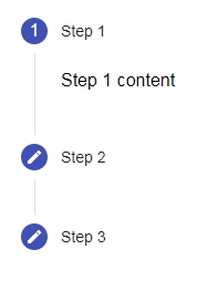
Similarly by adding themat-verticle-stepper as a wrapper around mat-steps, it will be placed in the vertical direction.
<mat-vertical-stepper>

  <mat-step label="Step 1">
    Step 1 content
  </mat-step>

  <mat-step label="Step 2">
    Step 2 content
  </mat-step>

  <mat-step label="Step 3">
    You are now done.
  </mat-step>

</mat-vertical-stepper>
Step Labels
Each step in the Stepper is created by adding the mat-step component. Simple text label of a step is added by using the label property of mat-step
<mat-vertical-stepper>
     <mat-step
         label="Step 1"
        >
        Step 1 content
      </mat-step>

     ....

<mat-vertical-stepper>
Adding a custom label on steps
The label property of mat-step is used to add simple text on steps, but for more complex label formats we can use templates.
The ng-template element with matStepLabel directive attribute inside the mat-step can have a custom step label.
<mat-vertical-stepper> <mat-step> <ng-template matStepLabel> <span> <u>Step</u> <i>One</i> </span> </ng-template> Step 1 content </mat-step> ... ... </mat-vertical-stepper></pre> <div> <div><img class="alignnone wp-image-4062 size-full" src="https://www.freakyjolly.com/wp-content/uploads/2019/08/Pasted-into-Angular-Material-98-Stepper-Tutorial-with-Examples.png" /></div> <div></div> <div></div> <h3>Positioning the label</h3> By using the <code>labelPositionproperty on themat-horizontal-stepperormat-vertical-stepper, we can align the label position respective to the step number. It can have the following positions:Step 1) To uselabelPosition="bottom"<mat-horizontal-stepper labelPosition="bottom"> ... </mat-horizontal-stepper></pre> <img class="alignnone wp-image-4063 size-full" src="https://www.freakyjolly.com/wp-content/uploads/2019/08/Pasted-into-Angular-Material-98-Stepper-Tutorial-with-Examples-1.png" /> </div> <div> <div><code>labelPosition="end"(Default)<mat-horizontal-stepper labelPosition="end"> ... </mat-horizontal-stepper></pre> </div> </div> </div> </div> </div> <img class="alignnone wp-image-4064 size-full" src="https://www.freakyjolly.com/wp-content/uploads/2019/08/Pasted-into-Angular-Material-98-Stepper-Tutorial-with-Examples-2.png" /> <div> <div> <h3>How to Customize Step Icons?</h3> By default each step have <code>createanddoneMaterial icons, but we can overridemat-iconelement. Using a template with a custom icon. Update the edit and done states with custom icons.mat-iconcomponent we need to import theMatIconModuleStep 2) To override the icons, import theSTEPPER_GLOBAL_OPTIONSto provide the stepper options to modify in component. After making changes in the app.module.ts file, it will look like this// app.module.ts import { BrowserModule } from '@angular/platform-browser'; import { NgModule } from '@angular/core'; import { AppRoutingModule } from './app-routing.module'; import { AppComponent } from './app.component'; import { BrowserAnimationsModule } from '@angular/platform-browser/animations'; import { MatStepperModule } from '@angular/material/stepper'; import { MatIconModule } from '@angular/material/icon'; import { STEPPER_GLOBAL_OPTIONS } from '@angular/cdk/stepper'; @NgModule({ declarations: [ AppComponent ], imports: [ BrowserModule, AppRoutingModule, BrowserAnimationsModule, MatStepperModule, MatIconModule ], providers: [ { provide: STEPPER_GLOBAL_OPTIONS, useValue: { displayDefaultIndicatorType: false } } ], bootstrap: [AppComponent] }) export class AppModule { }
Now in the template we will add following updated code
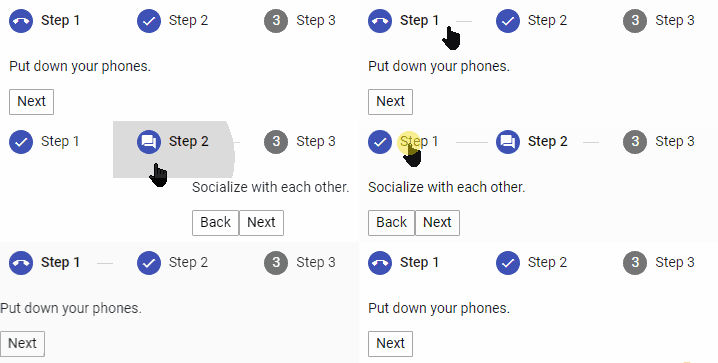
<mat-horizontal-stepper> <mat-step label="Step 1" state="phone"> <p>Put down your phones.</p> <div> <button mat-button matStepperNext>Next</button> </div> </mat-step> <mat-step label="Step 2" state="chat"> <p>Socialize with each other.</p> <div> <button mat-button matStepperPrevious>Back</button> <button mat-button matStepperNext>Next</button> </div> </mat-step> <mat-step label="Step 3"> <p>You're welcome.</p> </mat-step> <!-- Icon overrides. --> <ng-template matStepperIcon="phone"> <mat-icon>call_end</mat-icon> </ng-template> <ng-template matStepperIcon="chat"> <mat-icon>forum</mat-icon> </ng-template> </mat-horizontal-stepper></pre> Here we have created template for two icons <code>phoneandchatusing thematStepperIcon. Those will be used bymat-steppropertystate, to modify icons.
Stepper Buttons
For navigation to the next or previous step, we can use buttons in steps withmatStepperPreviousandmatStepperNextdirective.<mat-horizontal-stepper> ... ... <mat-step label="Step 2"> Step 2 content <div> <button mat-button matStepperPrevious>Back</button> <button mat-button matStepperNext>Next</button> </div> </mat-step> ... ... </mat-horizontal-stepper></pre> <a href="https://www.freakyjolly.com/wp-content/uploads/2019/08/Screenshot_3.jpg"><img class="aligncenter size-full wp-image-2752" src="https://www.freakyjolly.com/wp-content/uploads/2019/08/Screenshot_3.jpg" alt="" width="216" height="172" /></a> <h3></h3> <h3>Enable Linear Stepper</h3> By default, a user can step next without completing the details in the current step, but we can set a <code>linearproperty of onmat-horizontal-stepperand mat-vertical-stepper to true so that user must complete the current step to navigate to next.stepControlproperty can be used to check the validity of the current step.completedproperty can be used to set true or false manually to set is step is completedMake Step Optional
If any step is not required, then we can set the optional attribute to true on mat-step.<mat-step label="Step 2" optional="true"> Step 2 content <div> <button mat-button matStepperPrevious>Back</button> <button mat-button matStepperNext>Next</button> </div> </mat-step>Conclusion: The Angular material Stepper component provides a number of configurations, using which we can create a customized stepper component. A Stepper component is mainly used for creating a managed form to take the user of other information in chunks according to specific categorizations.
Category: Angular


