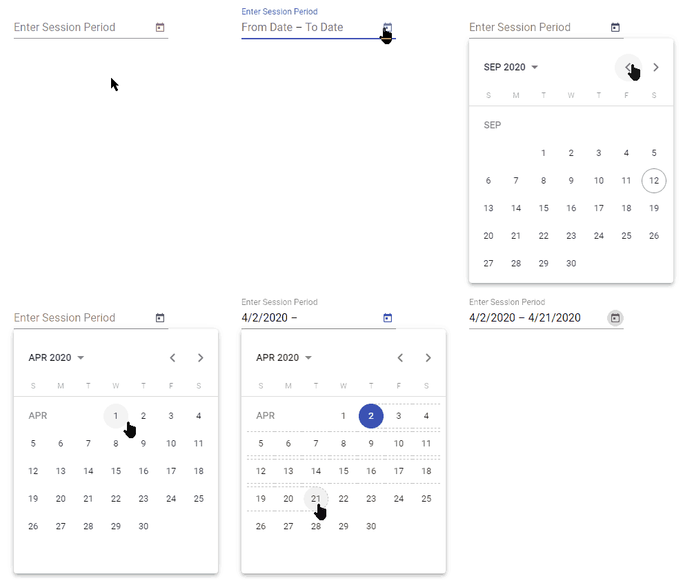
In this Angular Material tutorial, we’re going to discuss how to implement Material Datepicker with Range selection for From-To dates with required validation in Angular 12 application.
Angular Material Datepicker component can be easily implemented by importing the MatDatepickerModule and MatNativeDateModule or MatMomentDateModule APIs as discussed previous post with custom Date parse formats.
In the template, we simply add the <mat-datepicker/> component to create a datepicker. In this article, we’re going to discuss how to add a Datepicker with Range selection with validation, where a user can select a start date and to or end date.
The validation part will check if From and To dates are selected properly in the Datepicker.
Let’s start the implementation…
[lwptoc]
Setup Angular CLI
First, install or update the Angular CLI tool to the latest version by running the below NPM command
$ npm install -g @angular/cliYou can check the version of Angular currently installed
$ ng --version
Angular CLI: 10.0.3
Node: 12.15.0
OS: win32 x64
Create a New Angular Application
Run the following ng command to create a new Angular project
$ ng new angular-mat-datepicker-range
# ? Would you like to add Angular routing? No
# ? Which stylesheet format would you like to use? SCSS
Enter the project directory
$ cd angular-mat-datepicker-rangeRun the application
$ ng serve --open
Install Material Package
After creating the Angular project, install the Material UI library by hitting the following ng command
$ ng add @angular/material
? Choose a prebuilt theme name, or "custom" for a custom theme: Indigo/Pink
? Set up global Angular Material typography styles? No
? Set up browser animations for Angular Material? Yes
Using Datepicker Modules
There is a number of Modules available in the Material package, so we need to import the required modules which will be used in the application.
For using the Material Datepicker, we’ll import the MatDatepickerModule. The Datepicker also needs an Adapter to work with Javascript Date methods. There are three options available for Date Adapters.
MatNativeDateModule: Uses native Javascript Date methods.MatMomentDateModule: Uses Moment.js library to work with Date methods.- Custom
DateAdapter: We can also create our own customized Date adapter.
For the current to the tutorial, we’re going to use the MatNativeDateModule, as we’re not discussing custom Date Format using Moment. If you want to learn more about how to show a custom date format in Material datepicker visit this post.
Import Datepicker and Adapter in App Module
After installing the Material and Moment package, import the MatDatepicker and MatNativeDateModule. The MatInputModule module is also required to use Input control and FormsModule to use [(ngModel)].
so the app.module.ts file will look like this:
// app.module.ts
import { BrowserModule } from '@angular/platform-browser';
import { NgModule } from '@angular/core';

import { AppComponent } from './app.component';
import { BrowserAnimationsModule } from '@angular/platform-browser/animations';
import { FormsModule } from '@angular/forms';

import { MatDatepickerModule } from '@angular/material/datepicker';
import { MatInputModule } from '@angular/material/input';
import { MatNativeDateModule } from '@angular/material/core';

@NgModule({
  declarations: [
    AppComponent
  ],
  imports: [
    BrowserModule,
    BrowserAnimationsModule,
    FormsModule,

    MatDatepickerModule,
    MatNativeDateModule,

    MatInputModule,
  ],
  providers: [],
  bootstrap: [AppComponent]
})
export class AppModule { }
Adding Material Datepicker with Range Selection
To enable a user to select two for From and To, we need to wrap two <input/> inside the mat-date-range-input component.
<mat-date-range-input>
     <input matStartDate placeholder="Start date">
     <input matEndDate placeholder="End date">
</mat-date-range-input>
Then add the mat-date-range-picker component below it. This will create a slightly different calendar picker with a range selection feature.
<mat-form-field>

    <mat-label>Enter Session Period</mat-label>
    <mat-date-range-input [rangePicker]="picker">
      <input matStartDate placeholder="From Date">
      <input matEndDate placeholder="To Date">
    </mat-date-range-input>

    <mat-datepicker-toggle matSuffix [for]="picker"></mat-datepicker-toggle>
    <mat-date-range-picker #picker></mat-date-range-picker>

</mat-form-field>
Here we’re connecting the Datepicker calendar popup with [rangePicker] through the template variable #picker.
Adding Reactive Form Validation in Material Datepicker Range Selection
To add validation in a real-world application, we have wrapped the Datepicker with a <form/> having [formGroup] and (ngSubmit) event handler.
<form [formGroup]="dateRangeForm" (ngSubmit)="onFormSubmit()">
...
</form>
Now add a Material Datepicker for Range selection with <input/> controls having formControlName property
<mat-date-range-input [rangePicker]="picker">
        <input matStartDate placeholder="From Date" required formControlName="fromDate">
        <input matEndDate placeholder="To Date" required formControlName="toDate">
</mat-date-range-input>
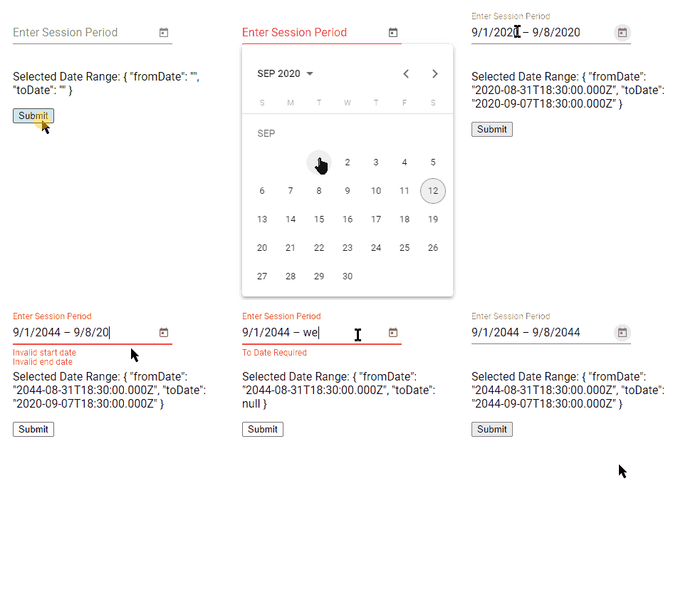
Also, add mat-error components to show error messages for showing required and invalid notification messages to users.
<!-- Invalid Date Messages -->
<mat-error *ngIf="dateRangeForm.controls.fromDate.hasError('matStartDateInvalid')">Invalid start date</mat-error>
<mat-error *ngIf="dateRangeForm.controls.toDate.hasError('matEndDateInvalid')">Invalid end date</mat-error>

<!-- Required Date Messages -->
<mat-error *ngIf="dateRangeForm.controls.fromDate.errors?.required">From Date Required</mat-error>
<mat-error *ngIf="dateRangeForm.controls.toDate.errors?.required">To Date Required</mat-error>
Finally, the complete form template will look like this:
<form [formGroup]="dateRangeForm" (ngSubmit)="onFormSubmit()">

    <mat-form-field>

      <mat-label>Enter Session Period</mat-label>

      <mat-date-range-input [rangePicker]="picker">
        <input matStartDate placeholder="From Date" required formControlName="fromDate">
        <input matEndDate placeholder="To Date" required formControlName="toDate">
      </mat-date-range-input>

      <mat-datepicker-toggle matSuffix [for]="picker"></mat-datepicker-toggle>
      <mat-date-range-picker #picker></mat-date-range-picker>

      <!-- Invalid Date Messages -->
      <mat-error *ngIf="dateRangeForm.controls.fromDate.hasError('matStartDateInvalid')">Invalid start date</mat-error>
      <mat-error *ngIf="dateRangeForm.controls.toDate.hasError('matEndDateInvalid')">Invalid end date</mat-error>

      <!-- Required Date Messages -->
      <mat-error *ngIf="dateRangeForm.controls.fromDate.errors?.required">From Date Required</mat-error>
      <mat-error *ngIf="dateRangeForm.controls.toDate.errors?.required">To Date Required</mat-error>

    </mat-form-field>

    <p>Selected Date Range: {{dateRangeForm.value | json}}</p>

    <button>Submit</button>

</form>
In the component.ts file, we’ll import the FormControl, FormBuilder, FormGroup and Validators classes to handle form validations.
the complete class component will look like this:
// app.component.ts
import { Component } from '@angular/core';
import { FormControl, FormBuilder, FormGroup, Validators } from '@angular/forms';


@Component({
  selector: 'app-root',
  templateUrl: './app.component.html',
  styleUrls: ['./app.component.scss']
})
export class AppComponent {
  title = 'angular-mat-datepicker-range';

  dateRangeForm: FormGroup;

  constructor(
    private formBuilder: FormBuilder,
  ) { }


  range = new FormGroup({
    fromDate: new FormControl('', Validators.required),
    toDate: new FormControl('', Validators.required)
  });

  ngOnInit(): void {
    this.dateRangeForm = this.formBuilder.group({
      fromDate: new FormControl('', Validators.required),
      toDate: new FormControl('', Validators.required)
    });
  }

  onFormSubmit() {
    console.log('Is Form Invalid', this.dateRangeForm.invalid);
  }
}
After adding the template and class component code the application will render a form having Datepicker with range selection and validation applied using the Reactive form approach.
Conclusion
Finally, we’re done with Material Datepicker having Range selection with propper Reactive form-based Validation messages. This can be easily plugged into any working form using Reactive form-based validation. The form-group instance can be used to control form status and check error on form-controls.4
Hope this tutorial was helpful, do share comments below.
Stay safe!


Leave a Reply