In this post, we’ll install Bootstrap powered ng-bootstrap package in Angular application and implement Bootstrap Date & Time picker with easy and quick setup. Also, we’ll check some common configurations and validation features available.
Bootstrap is a pack of awesome ready to plug UI components and also helps mobile-first application development. Bootstrap with Angular can make more powerful apps with already tried and tested web UI components that are fully responsive and supportive for any screen size.
Now we have one of the top Angular compatible Bootstrap UI library package the ng-bootstrap module. This Bootstrap package provides a wide variety of UI components which can speed up web application development with minimal configurations.
The ng-bootstrap‘s the latest version 6.x.x is compatible with Angular’s latest version 9.x.x. This package is compatible with previous Angular versions 8,7,6 & 5, for that you need to install a compatible version of ng-bootstrap. Here we’ll get to know to include the ng-bootstrap module in Angular project and also implement Datepicker and Time Picker Bootstrap component is a new Angular Project.
Let’s begin!
Also Check: Angular 8 Bootstrap 4 | Modal Tutorial By Example
#Update Angular CLI
Angular CLI tool needs to be updated for creating an Angular project with the latest stable version. Here we are currently using version 9.1.3. You can update the Angular CLI to the latest version by running following command
$ npm install -g @angular/cli</pre> <h3>#Create New Angular Project</h3> Run following ng command in the terminal and answer a few configuration questions to create a new Angular project. <pre class="wp-block-prismatic-blocks"><code class="language-javascript">$ ng new angular-bootstrap-datepicker-tutorial ? Would you like to add Angular routing? Yes ? Which stylesheet format would you like to use? CSS</pre> Move to the project director <pre class="wp-block-prismatic-blocks"><code class="language-javascript">$ cd angular-bootstrap-datepicker-tutorial</pre> If you have Visual Studio Code installed then run the following command to open the project in VS Code directly. <pre class="wp-block-prismatic-blocks"><code class="language-javascript">$ code .</pre> <h3>#Install and Configure the <code>ng-bootstrappackage After successfully setting up the Angular project, now we will install theng-bootstrappackage by executing below npm command at the project root.$ npm install --save @ng-bootstrap/ng-bootstrap</pre> <em><strong>Note</strong>: To install any previous version of ng-bootstrap to support older Angular version, you can add <code>@xafter the above command. For example, the Angular 7, run$ npm install --save @ng-bootstrap/ng-bootstrap@4#Adding Bootstrap Styling
The ng-bootstrap includes UI component modules only, to add styling to these components we need to include bootstrap.css styling file in the index.html at Angular project root<link rel="stylesheet" href="https://stackpath.bootstrapcdn.com/bootstrap/4.4.1/css/bootstrap.min.css" ></pre> <h3>#Import Bootstrap Module</h3> To use ng-bootstrap UI components across the application, we need to import the NgbModule in the App's main module. Import <code>NgbModule( Bootstrap module ) &FormsModule( for Angular as we'll use [(ngModel)] ) in the app.module.ts fileimport { BrowserModule } from '@angular/platform-browser'; import { NgModule } from '@angular/core'; import { AppComponent } from './app.component'; import { NgbModule } from '@ng-bootstrap/ng-bootstrap'; import { FormsModule } from '@angular/forms'; @NgModule({ declarations: [ AppComponent ], imports: [ BrowserModule, FormsModule, NgbModule ], providers: [], bootstrap: [AppComponent] }) export class AppModule { }That's it we are done with
ng-bootstrapsetup and configuration part. Next, we will check how to use Bootstrap components like a Date & Time picker.
#Add Datepicker Bootstrap Component in Application
Datepicker is implemented by adding the
ngb-datepickercomponent as an element or attribute in the template. It can be used in two ways
Inline Datepicker
Inline Datepicker can be placed, which is always visible to make selections.
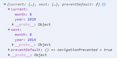
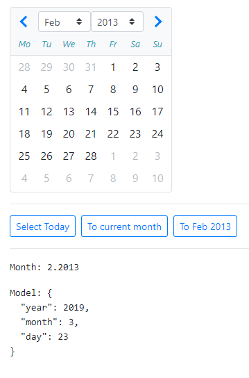
<ngb-datepicker #dp [(ngModel)]="model" (navigate)="navigateEvent($event)"></ngb-datepicker> <button class="btn btn-sm btn-outline-primary mr-2" (click)="selectToday()">Select Today</button> <button class="btn btn-sm btn-outline-primary mr-2" (click)="setCurrent()">To current month</button> <button class="btn btn-sm btn-outline-primary mr-2" (click)="setDate()">To Feb 2013</button> <pre>Month: {{ date.month }}.{{ date.year }}</pre> <pre>Model: {{ model | json }}</pre></pre> <strong><code>(navigate): Event-triggered when year or month is changed. It returns the following type of object to show the current and next state.
#dp: Template reference can be used to use Datepicker methods in the component class using@ViewChild()In the component class, import
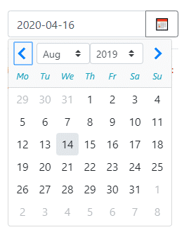
NgbDatepicker,NgbCalendarandNgbDateStructto use their methods to set, get or format Datepicker value.// app.component.ts import { Component, ViewChild } from '@angular/core'; import { NgbDateStruct, NgbCalendar, NgbDatepicker } from '@ng-bootstrap/ng-bootstrap'; @Component({ selector: 'app-root', templateUrl: './app.component.html', styleUrls: ['./app.component.css'] }) export class AppComponent { title = 'angular-bootstrap-datepicker-tutorial'; model: NgbDateStruct; date: { year: number, month: number }; @ViewChild('dp') dp: NgbDatepicker; constructor(private calendar: NgbCalendar) { } selectToday() { this.model = this.calendar.getToday(); } setCurrent() { //Current Date this.dp.navigateTo() } setDate() { //Set specific date this.dp.navigateTo({ year: 2013, month: 2 }); } navigateEvent(event) { this.date = event.next; } } </pre> <span style="text-decoration: underline;"><strong>Datepicker as a popup</strong></span> The <code>ngbDatepickeris used as an attribute in an Input control with an icon button to toggle Datepicker popup.<div class="input-group"> <input class="form-control" placeholder="yyyy-mm-dd" name="dp" [(ngModel)]="model" ngbDatepicker #d="ngbDatepicker"> <div class="input-group-append"> <button class="btn btn-outline-secondary calendar" (click)="d.toggle()" type="button">📅</button> </div> </div> <hr /> <code>Model: {{ model | json }}</code>
#Range Selection in Datepicker
In some scenarios, we may need to get range of days to get From-To or Start-End dates. In that case, we can use Range selection in the Datepicker. We also need to apply custom CSS for selection effect, as shown below:
<form class="form-inline">component in the template
<div class="form-group hidden">
<div class="input-group">
<input name="datepicker" class="form-control" ngbDatepicker #datepicker="ngbDatepicker" [autoClose]="'outside'"
(dateSelect)="onDateSelection($event)" [displayMonths]="1" [dayTemplate]="t" outsideDays="hidden"
[startDate]="fromDate!">
<ng-template #t let-date let-focused="focused">
<span class="custom-day" [class.focused]="focused" [class.range]="isRange(date)"
[class.faded]="isHovered(date) || isInside(date)" (mouseenter)="hoveredDate = date"
(mouseleave)="hoveredDate = null">
{{ date.day }}
</span>
</ng-template>
</div>
</div>
<div class="form-group">
<div class="input-group">
<input #dpFromDate class="form-control" placeholder="yyyy-mm-dd" name="dpFromDate"
[value]="formatter.format(fromDate)" (input)="fromDate = validateInput(fromDate, dpFromDate.value)">
<div class="input-group-append">
<button class="btn btn-outline-secondary calendar" (click)="datepicker.toggle()" type="button">📅</button>
</div>
</div>
</div>
<div class="form-group ml-2">
<div class="input-group">
<input #dpToDate class="form-control" placeholder="yyyy-mm-dd" name="dpToDate"
[value]="formatter.format(toDate)" (input)="toDate = validateInput(toDate, dpToDate.value)">
<div class="input-group-append">
<button class="btn btn-outline-secondary calendar" (click)="datepicker.toggle()" type="button">📅</button>
</div>
</div>
</div>
</form><hr />
<pre>From date model: {{ fromDate | json }}</pre>
<pre>To date model: {{ toDate | json }}</pre>
</pre>
Update Class
<pre class="wp-block-prismatic-blocks"><code class="language-javascript">// app.component.ts
import { Component } from '@angular/core';
import { NgbCalendar, NgbDate, NgbDateParserFormatter } from '@ng-bootstrap/ng-bootstrap';@Component({
selector: 'app-root',
templateUrl: './app.component.html',
styleUrls: ['./app.component.css']
})
export class AppComponent {
title = 'angular-bootstrap-datepicker-tutorial';hoveredDate: NgbDate | null = null;
fromDate: NgbDate | null;
toDate: NgbDate | null;constructor(private calendar: NgbCalendar, public formatter: NgbDateParserFormatter) {
this.fromDate = calendar.getToday();
this.toDate = calendar.getNext(calendar.getToday(), 'd', 10);
}onDateSelection(date: NgbDate) {
if (!this.fromDate && !this.toDate) {
this.fromDate = date;
} else if (this.fromDate && !this.toDate && date && date.after(this.fromDate)) {
this.toDate = date;
} else {
this.toDate = null;
this.fromDate = date;
}
}isHovered(date: NgbDate) {
return this.fromDate && !this.toDate && this.hoveredDate && date.after(this.fromDate) && date.before(this.hoveredDate);
}isInside(date: NgbDate) {
return this.toDate && date.after(this.fromDate) && date.before(this.toDate);
}isRange(date: NgbDate) {
return date.equals(this.fromDate) || (this.toDate && date.equals(this.toDate)) || this.isInside(date) || this.isHovered(date);
}validateInput(currentValue: NgbDate | null, input: string): NgbDate | null {
const parsed = this.formatter.parse(input);
return parsed && this.calendar.isValid(NgbDate.from(parsed)) ? NgbDate.from(parsed) : currentValue;
}}
</pre>
Add style in <strong>app.component.css</strong>
<pre><code class="language-scss">.form-group.hidden {
width: 0;
margin: 0;
border: none;
padding: 0;
}
.custom-day {
text-align: center;
padding: 0.185rem 0.25rem;
display: inline-block;
height: 2rem;
width: 2rem;
}
.custom-day.focused {
background-color: #e6e6e6;
}
.custom-day.range, .custom-day:hover {
background-color: rgb(2, 117, 216);
color: white;
}
.custom-day.faded {
background-color: rgba(2, 117, 216, 0.5);
}</pre>
You can check more working examples <a href="https://ng-bootstrap.github.io/#/components/datepicker/examples" target="_blank" rel="noopener noreferrer">here</a>
<h2>Bootstrap Timepicker in Angular Application</h2>
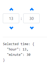
The Timepicker control is used to select a time by a user. In ng-bootstrap, a Timepicker can be implemented by adding the <code>ngb-timepicker#Timepicker
<ngb-timepicker [(ngModel)]="time"></ngb-timepicker>package. We implemented Datepicker and Timepicker components to provide great Date and Time selection controls to a user. This bootstrap package is very simple and easy to use with fully-featured options, so by following the above steps, you can add any type of Bootstrap widget in Angular's latest version.
<hr>
<pre>Selected time: {{time | json}}</pre></pre>
<pre class="wp-block-prismatic-blocks"><code class="language-javascript">import {Component} from '@angular/core';@Component({
selector: 'ngbd-timepicker-basic',
templateUrl: './timepicker-basic.html'
})
export class NgbdTimepickerBasic {
time = {hour: 13, minute: 30};
}</pre>
Check more options and examples for ng-bootstrap Timepicker component <a href="https://ng-bootstrap.github.io/#/components/timepicker/examples" target="_blank" rel="noopener noreferrer">here</a><strong>Conclusion</strong>: The NgBootstrap package provides a number of UI components. In this post, we discussed how to add Bootstrap components in the Angular project using the <code>ng-bootstrap
Category: Angular


I was looking for a date picker with no Material look and feel. And I finally got that. Thanks for sharing userfull tutorial.
The popup doesn’t work. There is no “exportAs method”, so you can not assign it like ” #d=”ngbDatepicker””, it crashes
Hi Seba, please check this working demo