The Star Rating component is widely used in web applications to get user feedback. Rating widget provides a quick way to get user responses on a large number reflecting the quality of service they are provided.
Web applications dealing with customers can show a Rating widget that is fully customizable to meet brand themes.
How to add Star Rating widget in Angular application using ng-bootstrap?
Here we will create a new Angular project using CLI and install ng-bootstrap. After that, we will quickly implement the Star rating widget and also discuss its available customizations.
Step 1 – Create New Angular Project Using CLI
First, we will create a new Angular project using Angular CLI. Make sure you have installed the latest version on Angular CLI by running the following command
$ npm install -g @angular/cliCreate a new Angular project then select few options asked. We have not selected Angular routing to make this demo easier.
$ ng new angular-star-rating-app
? Would you like to add Angular routing? No
? Which stylesheet format would you like to use? SCSS
Change directory to point our project
$ cd angular-star-rating-appIf you have Visual Studio Code installed then run the following command to open the project in VS Code directly.
$ code .Install Bootstrap in Angular Project
Let’s install the NgBootstrap library by running the following NPM command.
$ ng add @ng-bootstrap/ng-bootstrapIt will auto-import the bootstrap style and update the App Module as well.
Add Star Rating Component
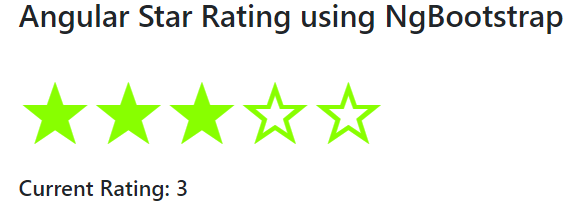
To show up a simple and basic Star rating component, just add the following template in the app.component.html file
<h3>Angular Star Rating using NgBootstrap</h3>

<ngb-rating [max]="5" [(rate)]="currentRating" [readonly]="false"></ngb-rating>
<h5>Current Rating: {{currentRating}}</h5>
Here [(rate)] is like ngModel for two-way binding. The <ngb-rating> directive will create a simple rating component.
Update Component Class
Next, open the app.component.ts file to add the currentRating variable.
import { Component } from '@angular/core';

@Component({
  selector: 'app-root',
  templateUrl: './app.component.html',
  styleUrls: ['./app.component.scss']
})
export class AppComponent {

  currentRating = 3;

}
Adding Style
Now, add the following style in the app.component.scss file
ngb-rating {
    color: #88ff00;
    font-size: 80px;
}
Events Available
Two events are available (hover) and (leave)
ReadOnly Rating
[readonly] takes boolean to disable selection
<ngb-rating [(rate)]="selected" (hover)="hovered=$event" (leave)="hovered=0" [readonly]="readonly"></ngb-rating>
<hr>
<pre>
Selected: <b>{{selected}}</b>
Hovered: <b>{{hovered}}</b>
</pre>
<button class="btn btn-sm btn-outline-{{readonly ? 'danger' : 'success'}}" (click)="readonly = !readonly">
  {{ readonly ? "readonly" : "editable"}}
</button>
Custom Rating Template
We can have a custom template using <ng-template> tags then adding a template reference variable in [starTemplate] parameter
  <ng-template #t let-fill="fill">
    <span class="gift" [class.full]="fill === 100">
      <span class="half" [style.width.%]="fill">🎁</span>🎁
    </span>
  </ng-template>

  <ngb-rating
  [(rate)]="currentRate"
  [starTemplate]="t"
  [readonly]="true"
  max="5">
  </ngb-rating>
In the app.component.ts file add the following style
//app.component.ts
import { Component } from '@angular/core';

@Component({
  selector: 'app-root',
  templateUrl: './app.component.html',
  styles: [`
    .gift {
      position: relative;
      display: inline-block;
      font-size: 3rem;
      color: #d3d3d3;
    }
    .full {
      color: #ffa600;
    }
    .half {
      position: absolute;
      display: inline-block;
      overflow: hidden;
      color: #ffa600;
    }
  `]
})
export class AppComponent {
  currentRate = 3.2;
}
Conclusion
We are completed with the star rating implementation example tutorial. We discussed adding a bootstrap star rating component with configuration properties. Moreover, we can also add a custom template to represent a custom login to show our rating. Using a custom template Star rating can be easily modified for required themes and is very easy to implement.


