Tabs component organizes different content views at one area where only one is visible time and the user can switch them by clicking on each tab’s header name.
Angular Material Tabs create a beautiful layout filled with animation. Each tab section is provided with a header label name which can be clicked to show its content on the same place.
In this tutorial, we will add Angular Material Tab’s component and also discuss available options and features in Tab’s component.
Let’s get started!
Here we have an Angular project with Material with version 8.0.1 already installed.
Check here on How to Install Angular Material in Angular project.
Import MatTabsModule in App’s Module
To use any Material component we need to import it in the app’s module file to make it available throughout the application.
Now open app.module.ts file then import MatTabsModule and also add in imports array as shown below:
//app.module.ts
import { BrowserModule } from '@angular/platform-browser';
import { NgModule } from '@angular/core';

import { AppRoutingModule } from './app-routing.module';
import { AppComponent } from './app.component';
import { BrowserAnimationsModule } from '@angular/platform-browser/animations';

import {
  MatTabsModule
 } from '@angular/material';


@NgModule({
  declarations: [
    AppComponent
  ],
  imports: [
    BrowserModule,
    AppRoutingModule,
    BrowserAnimationsModule,

    MatTabsModule
  ],
  providers: [],
  bootstrap: [AppComponent]
})
export class AppModule { }
Add Tabs in Component
In the component template, we will add <mat-tab-group> directive which wraps all tabs to show.
Each tab with content is added using the <mat-tab> directive as follows:
<mat-tab-group>
  <mat-tab label="First"> Content 1 </mat-tab>
  <mat-tab label="Second"> Content 2 </mat-tab>
  <mat-tab label="Third"> Content 3 </mat-tab>
</mat-tab-group>
This will create tabs layout in view:
Feature Options:
Disable Tab
Tab can be disabled by adding a disabled property on <mat-tab>
<mat-tab label="First" disabled="true">
...
...
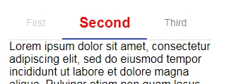
Custom Template for Tabs
A custom template on tabs can be added using NgTemplate with MatTabLabel directive
  <mat-tab>
    <ng-template mat-tab-label>
      <span style="font-weight: bold;font-size: 20px; color:red">
        Second using NgTemplate with MatTabLabel directive
      </span>
    </ng-template>
    Lorem ipsum dolor....
.....
Set Active Tab
Active tab can selected by adding [selectedIndex] property taking index number(starts from 0) of tab on <mat-tab-group> directive.
export class AppComponent {
  activeTab = 0;
  ....
<mat-tab-group [selectedIndex]="activeTab">
<mat-tab label="First">
.....Tab Change Event
(selectedIndexChange) on <mat-tab-group> is triggered when ever tab is changed amnually or by changing [selectedIndex] value.
  <mat-tab-group [selectedIndex]="activeTab" (selectedIndexChange)="tabChanged($event)">
    <mat-tab label="First" disabled="true">
    .....
Tab Header Position
Position ob Tab Header can be changed by adding headerPosition property on <mat-tab-group> with values ‘above‘ or ‘below‘;
 <mat-tab-group headerPosition="below">
  <mat-tab label="First"> Content 1 </mat-tab>
  ...
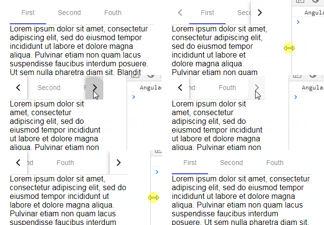
Show Next Previous Arrows in Tab Header
Angular Material tabs will show Arrows for navigation automatically if they are taking up more space the view area. No configuration is required 🙂


