In this Angular 9/8/7/6 tutorial, we’ll learn how to show text Tooltips on hover in Angular application without using any other UI library like Material or Bootstrap.
Tooltips play an important role to provide a more informative user-friendly interface. Tooltips are small information boxes that show up floating on a specific area to give some sort of textual information.
In Angular web applications also we may want to integrate tooltips on some key areas like icons, action buttons or to show full information, etc.
What is ng2-tooltip-directive?
The ng2-tooltip-directive package provides use fully-features directives to add Tooltips in Angular project without installing any other UI package or libraries like Material or Bootstrap.
This is a very lightweight module with lots of configurations and customizations available like tooltip Auto-placing, HTML tags, and template in the tooltip, show/ hide delays, animation control, CSS custom styling, etc.
Also, check Angular Tooltips using Material and Bootstrap.
Here we will discuss the implementation of a very simple tooltip module in Angular application, which is independent of any other library or framework like jQuery or Bootstrap.
So let’s get started!
[lwptoc]
Setup Angular CLI
First, make sure you have the latest version on NG CLI installed on your system. Run the following command to update
$ npm install -g @angular/cliCreate a new Angular project
Now we will create a new Angular project latest version 7. If you already have an Angular project just ahead with that.
# Create project
$ ng new ngTooltip

# Enter project root
$ cd ngTooltip

# Open code in Visual Studio
$ code .

# Run application
$ ng serve
Install ng2-tooltip-directive
We are going to use the ng2-tooltip-directive npm module to show tooltips in the Angular project.
Install it by running following NPM command
$ npm i ng2-tooltip-directive --saveUpdate App Module
After installation of tooltip package, we will import the TooltipModule in the app.module.ts file as shown below
//app.module.ts
import { BrowserModule } from '@angular/platform-browser';
import { NgModule } from '@angular/core';

import { AppComponent } from './app.component';

import { TooltipModule } from 'ng2-tooltip-directive';

@NgModule({
  declarations: [
    AppComponent
  ],
  imports: [
    BrowserModule,
    TooltipModule
  ],
  providers: [],
  bootstrap: [AppComponent]
})
export class AppModule { }
Using Tooltips in Application
Showing tooltip on an element is very simple, you only need to add tooltip directive in an element as shown below
<span tooltip="Tooltip">Simple Tooltip</span>
Set Position of Tooltip
The position of the tooltip can be set by adding the placement property with these options "top", "bottom", "left", "right"
<div style="padding: 150px; margin: auto;">

  <button tooltip="Tooltip on left" placement="left">Tooltip on left</button>
  <button tooltip="Tooltip on right" placement="right">Tooltip on right</button>
  <button tooltip="Tooltip on top" placement="top">Tooltip on top</button>
  <button tooltip="Tooltip on bottom" placement="bottom">Tooltip on bottom</button>

</div>
Auto-placement
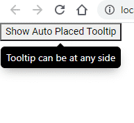
If we are not sure about the placement to be set of the tooltip, just set autoPlacement="true". It is set to true by default
<button tooltip="Tooltip can be at any side" autoPlacement="true">
  Show Auto Placed Tooltip
</button>
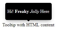
Show HTML tags inside Tooltip text
We can easily add HTML tags inside the tooltip property
<button tooltip="Simple and <b>bold text</b>">Tooltip with HTML content</button>
Custom Template for Tooltips
To add a custom template for the tooltip, we add the [tooltip]="HtmlContent" with a template using an ng-template
<ng-template #HtmlContent>
    <div>Simple and <b>bold text</b></div>
</ng-template>

<button [tooltip]="HtmlContent" content-type="template">
    Tooltip with HTML template content
</button>
Adding Show/ Hide Delays for Tooltips
The [show-delay] and [hide-delay] properties take values in milliseconds.
<button tooltip="Show delay 1000ms" [show-delay]="1000">Show delay 1000ms</button>
<button tooltip="Hide delay 1000ms" [hide-delay]="1000">Hide delay 1000ms</button>
Tooltips on Touch Screens
Enable Tooltips on Touch devices
The [displayTouchscreen] can be set to true or false to enable or disable tooltip on touch devices.
Hide Delay on Touchscreen
The [hideDelayTouchscreen] property can be used for touch device’s experience.
<button tooltip="Hide delay on touch screen 2000ms" [hideDelayTouchscreen]="2000">Hide delay on touch screen 2000ms</button>
Trigger Events for Tooltip
The [trigger] property can be used add "click" event instead of "hover" which is used by default.
<button tooltip="On click" [trigger]="'click'">On click</button>
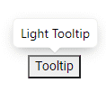
Dark/ Light Theme
The theme property can be set to "light" or "dark"(default)
Width & Max Width of Tooltip
The [width] property set fixed width of the tooltip
<button tooltip="Width 200 pixels" [width]="200">Width 200 pixels</button>
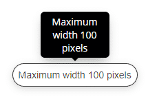
The [max-width] property takes care that width doesn’t go beyond defined max-width.
<button tooltip="Maximum width 100 pixels" [max-width]="100">Maximum width 100 pixels</button>
Custom Position of Tooltip
We can set the position of tooltip by setting its x and y-axis using the [position] property
<button tooltip="Custom position" placement="bottom" [position]="{top: 0, left: 200}">Custom position</button>To position it on a specific element, you can use a jquery offset() or javascript method.
Adding Offset or Custom Tooltip Distance
We can apply custom distance offset between the element and its respective tooltip by using the [offset] property
<button tooltip="Offset 16px" [offset]="16">Offset 16px</button>
Conclusion
Finally, we have implemented the Tooltip in the Angular project by using the ng2-tooltip-directive and discussed its various important properties to customize the behavior. We can easily add HTML using a template or inline tags. Also, check more details on property options available in docs here


Leave a Reply