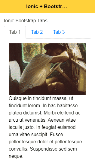
In this Ionic 5/4 tutorial, we’ll add the Tabs component in the Ionic Angular application page without Routing. We’ll be using the Ngx-Bootstrap package to integrate Bootstrap in the Angular project.
We have already discussed how to add Tabs in an application using Ionic Framework using the UI component. But these Tabs have their own component with Routing for each. But if we want to have a local page tabset, we can use the Bootstrap UI component to achieve this.
[lwptoc]
What is ngx-bootstrap?
The ngx-bootstrap package module is exclusively developed to use bootstrap UI components in the Angular application. There is a wide variety of Bootstrap components available which are very easy to use and integrate into the Angular project.
Let’s start and integrate Bootstrap into our Ionic application…
Install or Update Ionic CLI
You can install or update the @ionic/cli package by running below command
$ npm install -g @ionic/cli
Create an Ionic Application
To start from scratch, create a new Ionic Angular application with a blank template by running the following command.
$ ionic start ionic-bootstrap-tabs-app blank --type=angular
Move inside the application folder
$ cd ionic-bootstrap-tabs-app
Open the application code
# Open in Visual Studio Code
$ code .
Adding Bootstrap in Ionic Application
Now we’ll set up Bootstrap in our Ionic Angular application by installing the bootstrap and ngx-bootstrap packages and configure to use SCSS or CSS bootstrap style from the bootstrap package and UI components for Angular project with the help of ngx-bootstrap.
Install and Configure bootstrap
The ngx-bootstrap only provides with Angular compatible UI components, for adding bootstrap style we need to install the bootstrap module
$ npm install bootstrapNow, open the angular.json file and add bootstrap.scss file in the styles property as shown below:
...
"styles": [
              ...
              {
                "input": "./node_modules/bootstrap/scss/bootstrap.scss"
              }
            ],
...
Install ng-bootstrap package
Next, install the ngx-bootstrap package by hitting below command
$ npm i ngx-bootstrapUsing Bootstrap UI components in Ionic Application
For using a UI component, we need to import its class in the Components module. For example we need Bootstrap Tabs in our Home Page.
Import Bootstrap Component in Module
Open the home.module.ts file, import the TabsModule class then add in the imports Array as shown below:
//home.module.ts
...
import { TabsModule } from 'ngx-bootstrap/tabs';

@NgModule({
  imports: [
    CommonModule,
    FormsModule,
    IonicModule,
    HomePageRoutingModule,

    TabsModule.forRoot()
  ],
  declarations: [HomePage]
})
export class HomePageModule { }
Similarly you can import any API class for any bootstrap component to use in the Ionic page.
Update the Template
Now we simply need to add the template for Tabs in the home.page.html file
<ion-content [fullscreen]="true" class="ion-padding">

  <h6>Ionic Bootstrap Tabs</h6>

  <tabset>

    <!-- Tab 1 -->
    <tab heading="Tab 1" id="tab1">
      Tab Content 1
    </tab>

    <!-- Tab 2 -->
    <tab heading="Tab 2">
      Tab Content 2
    </tab>

    <!-- Tab 3 -->
    <tab heading="Tab 3">
      Tab Content 3
    </tab>

  </tabset>

</ion-content>
Now run the Ionic application to see working Bootstrap simple Tabset component
Configurations & Event handling
Let’s discuss how to use Tabs in real application with most-used properties and event handling.
Tab Select Event
The (selectTab) event handler is added on <tab> to get selected tab properties
<tabset>

  <tab heading="First tab" (selectTab)="onSelect($event)">

    <h4>Title</h4>
    <p>Lorem Ipsum is simply dummy text </p>

  </tab>

  <tab heading="Second tab" (selectTab)="onSelect($event)">

    <h4>Title 2</h4>
    <p>It has survived not only</p>

  </tab>

</tabset>
In the class, import the TabDirective and define onSelect() method
// home.page.ts
import { Component } from '@angular/core';
import { TabDirective } from 'ngx-bootstrap/tabs';

@Component({
  selector: 'app-home',
  templateUrl: 'home.page.html',
  styleUrls: ['home.page.scss'],
})
export class HomePage {

  constructor() { }

  onSelect(data: TabDirective): void {
    console.log(data.heading); // OUTPUT 'Tab 1'
  }

}
Custom Tab Template
We can have custom tab template instead of using the heading property as shown below
<tabset>
    <tab heading="Static">
      Tab 1
    </tab>
    <tab>
      <ng-template tabHeading>
        <span class="badge badge-secondary">Heading</span>
      </ng-template>
      I've got an HTML heading. Pretty cool!
    </tab>
    <tab>
      <ng-template tabHeading>
        <i><b>Tab 3</b></i>
      </ng-template>
      Tab with html tags in heading
    </tab>
  </tabset>
Get Tabs Reference using #Template Variable
Using Template reference variable and @ViewChild() combination, we can:
1. Manually Select a Tab
# Template HTML
<div>
  <p>You can select tabs directly from component</p>
  <p>
    <button type="button" class="btn btn-primary btn-sm" (click)="selectTab(1)">Select second tab</button>
    <button type="button" class="btn btn-primary btn-sm" (click)="selectTab(2)">Select third tab</button>
  </p>
  <hr/>
  <tabset #staticTabs>
    <tab heading="Static title">Static content</tab>
    <tab heading="Static Title 1">Static content 1</tab>
    <tab heading="Static Title 2">Static content 2</tab>
    <tab heading="Static Title 3">Static content 3</tab>
  </tabset>
</div>
#Component Class
import { Component, ViewChild } from '@angular/core';
import { TabsetComponent } from 'ngx-bootstrap/tabs';

@Component({
  selector: 'demo-tabs-manual-selection',
  templateUrl: './manual-selection.html'
})
export class DemoTabsManualSelectionComponent {
  @ViewChild('staticTabs', { static: false }) staticTabs: TabsetComponent;

  selectTab(tabId: number) {
    this.staticTabs.tabs[tabId].active = true;
  }
}
2. Enable or Disable Tabs
#Template HTML
<div>
  <p>Tabs can be enabled or disabled by changing <code>disabled</code> input property</p>
  <p>
    <button type="button" class="btn btn-primary btn-sm" (click)="disableEnable()">
      Enable / Disable third tab
    </button>
  </p>
  <hr/>
  <tabset #staticTabs>
    <tab heading="Static title">Static content</tab>
    <tab heading="Static Title 1">Static content 1</tab>
    <tab heading="Static Title 2">Static content 2</tab>
    <tab heading="Static Title 3">Static content 3</tab>
  </tabset>
</div>
# Component Class
import { Component, ViewChild } from '@angular/core';
import { TabsetComponent } from 'ngx-bootstrap/tabs';

@Component({
  selector: 'demo-tabs-disabled',
  templateUrl: './disabled.html'
})
export class DemoTabsDisabledComponent {
  @ViewChild('staticTabs', { static: false }) staticTabs: TabsetComponent;

  disableEnable() {
    this.staticTabs.tabs[2].disabled = !this.staticTabs.tabs[2].disabled;
  }
}
You can check more API details on official documentation.
Conclusion
We discussed how to integrate Bootstrap component in Ionic Angular application using the ngx-bootstrap pacakge module and implement the Tabs component very easily. You can add any available Bootstrap component in a similar manner in an Ionic application.
Hope you enjoyed this tutorial, please share with others. Also share your feedback and suggestions using comment section or contact us form. Thanks for reading!


Leave a Reply