In this Ionic 5/4 tutorial, how to add Datepicker and Timepicker in Ionic Angular application using Ionic UI components without using any Native plugins.
Ionic supports a new Date and Time picker UI component which can be added in the application without any Native or third party module. Implementation of Ionic’s date and time picker is very easy and very flexible in terms of formatting date-time formats of adding any min or max validation.
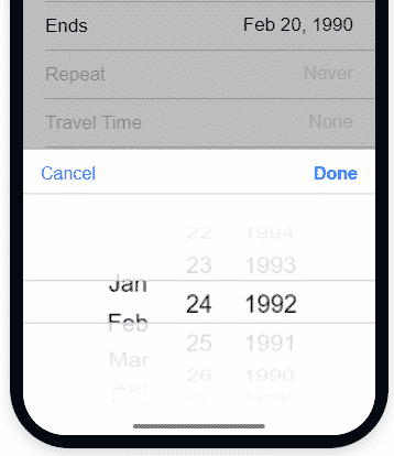
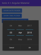
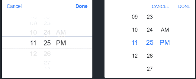
The Date & Time picker is created by adding the<span class="token tag">ion-datetime</span> directive component in the template. It is shown in the slider form where the user can select the date, month, and year by simply swiping up and down to slide the numbers similar in the case of Time picker.
The picker container is shown as a dialog overlay over the content making it convenient and more user friendly to select the Date and TIme.
We’ll be creating a new Ionic Angular app using the latest Ionic CLI. Let’s start with the implementation…
If you looking for Date & Timepicker in Ionic Application using Cordova and Native plugin, visit this post.
Install or Update Ionic CLI
You can install or update the Ionic CLI to the latest version by executing the below npm command
$ npm install -g @ionic/cli
Create New Ionic App
Run the following command to create a new Ionic Angular application with a blank template
$ ionic start ionic-date-time-picker-app blank --type=angular
Move inside the application folder
$ cd ionic-date-time-picker-app
Open application
$ ionic serve --labYou may be asked to install the Ionic Lab
? Install @ionic/lab? Yes
How to Add a DateTime Picker in Ionic Page?
The picker displays scrollable columns that can be used to individually select years, months, days, hours, and minute values. It is created by adding the ion-datetime directive in the template HTML.
<ion-datetime placeholder="Select Date"></ion-datetime>
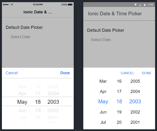
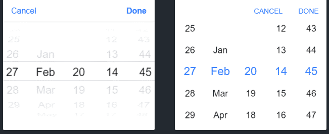
This will create a Datepicker by default to select Date, Month and Year as shown below with Cancel and Done buttons
How to Change the format for Date & Time Selection?
The format of the date and time selection can be modified by adding the displayFormat property on ion-datetime components
Show Datepicker in Ionic Page
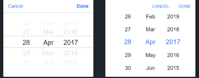
To show the Date picker we have set the displayFormat="DD-MMM-YYYY"
<ion-item>
    <ion-label>Date</ion-label>
    <ion-datetime displayFormat="DD-MMM-YYYY"></ion-datetime>
  </ion-item>
Show Timepicker in Ionic Page
To enable time selection set displayFormat="hh-mm-A"
<ion-item>
    <ion-label>Time</ion-label>
    <ion-datetime displayFormat="hh-mm-A"></ion-datetime>
  </ion-item>
Show both Date & Time Picker
Set displayFormat="DD-MMM-YY HH:mm" to adjust both date and time selection
<ion-item>
    <ion-label>Date & Time</ion-label>
    <ion-datetime displayFormat="DD-MMM-YY HH:mm"></ion-datetime>
  </ion-item>
Show Different Format for Selection and Display using pickerFormat ?
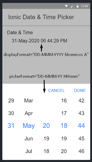
Generally, the format we set in the dateFormat property is shown after selection, but in case we want to have a different format for selection and display, use the pickerFormat property.
<ion-label>Date & Time</ion-label>

  <ion-datetime
  displayFormat="DD-MMM-YYYY hh:mm:ss A"
  pickerFormat="DD-MMM-YY HH:mm">
  </ion-datetime>
Setting Min and Max Properties
We only need to add <strong>min</strong> & <strong>max</strong> properties on the <strong>ion-datepicker</strong> directive to set an upper or lower limit for selection
<ion-item>
    <ion-label>Date</ion-label>

    <ion-datetime
    displayFormat="MMMM YY"
    min="1989-06-04"
    max="2004-08-23"
    value="1994-12-15T13:47:20.789">
    </ion-datetime>

  </ion-item>
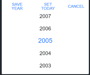
The [pickerOptions] property can take a configuration object to customize the button text and add a custom function handler
<ion-item>

    <ion-label>Select Year</ion-label>

    <ion-datetime
    #mydt
    [pickerOptions]="customPickerOptions"
    placeholder="Custom Options"
    displayFormat="YYYY"
    min="2002"
    max="2010"
    [(ngModel)]="selYear">
    </ion-datetime>

  </ion-item>
In the above code, we added a template reference #mydt to set values to the [(ngModel)]
export class HomePage {
  customPickerOptions: any;
  selYear: any;

  @ViewChild('mydt') mydt: IonDatetime;

  constructor() {
    this.customPickerOptions = {
      buttons: [{
        text: 'Save Year',
        handler: (res) => {
          console.log('Save Year', res)
          this.mydt.value = res.year.text;
        }
      }, {
        text: 'Set Today',
        handler: (res) => {
          console.log('Set Today', res)
          this.mydt.value = "2020";
        }
      }, {
        text: 'Cancel',
        handler: () => {
          console.log('Clicked Log. Do not Dismiss.');
          return false;
        }
      }]
    }
  }

}
We have added a new custom event "Set Today" which will set the current Year even when we have set max="2010".
Properties and Methods Available on ion-datetime
Let’s have a look at Properties and Methods at a glance:
Properties
cancelText: The text to display on the picker’s cancel button. Default'Cancel'disabled: If true, the user cannot interact with the DateTime.displayFormat: The display format of the date and time as text that shows within the item.displayTimezone: The timezone to use for display purposes only. See Date.prototype.toLocaleString() for a list of supported timezones. If no value is provided, the component will default to displaying times in the user’s local timezone.doneText: The text to display on the picker’s"Done"button. Default'Done'max: The maximum DateTime allowed.min: The minimum DateTime allowed.mode: The mode determines which platform styles to use. Type"ios"|"md"monthNames: Full names for each month’s name. This can be used to provide locale month names. Defaults to English.monthShortNames: Short abbreviated names for each month’s name.monthValues: Values used to create a list of selectable months.name: The name of the control, which is submitted with the form data.pickerFormat: The format of the date and time picker columns the user selects.pickerOptions: Any additional options that the picker interface can accept. Following are the supported properties:
{
columns?: PickerColumn[] | undefined;
buttons?: PickerButton[] | undefined;
cssClass?: string | string[] | undefined;
showBackdrop?: boolean | undefined;
backdropDismiss?: boolean | undefined;
animated?: boolean | undefined;
mode?: "ios" | "md" | undefined;
keyboardClose?: boolean | undefined;
id?: string | undefined;
enterAnimation?: AnimationBuilder | undefined;
leaveAnimation?: AnimationBuilder | undefined;
}
placeholder: The text to display when there’s no date selected yet. Using lowercase to match the input attributereadonly: If true, the DateTime appears normal but is not interactive.value: The value of the DateTime as a valid ISO 8601 DateTime string.minuteValues: Values used to create a list of selectable minutes. By default, the minutes range from 0 to 59.hourValues: Values used to create a list of selectable hours. By default, the hour values range from 0 to 23 for 24-hour, or 1 to 12 for 12-hour.dayNames: Full day of the week names. This can be used to provide locale names for each day in the week. Defaults to English.dayShortNames: Short abbreviated day of the week names.dayValues: Values used to create a list of selectable days.yearValues: Values used to create a list of selectable years. For example, to show upcoming and recent leap years, then this input’s value would beyearValues="2024,2020,2016,2012,2008".
Methods
ionBlur():Emitted when the datetime loses focus.ionCancel():Emitted when the datetime selection was cancelled.ionChange():Emitted when the value (selected date) has changed.ionFocus():Emitted when the datetime has focus.
Conclusion
We have discussed how to add DateTime Picker in Ionic Angular application using UI complemented available in the Framework itself. We don’t need to use any third-party plugin to implement this awesome picker. Also, we got to know about various configurations and properties available to customize the format of DateTime picker with examples. Check more details on available properties on docs here
Hope you enjoyed this tutorial, do share your suggestions and feedback …

