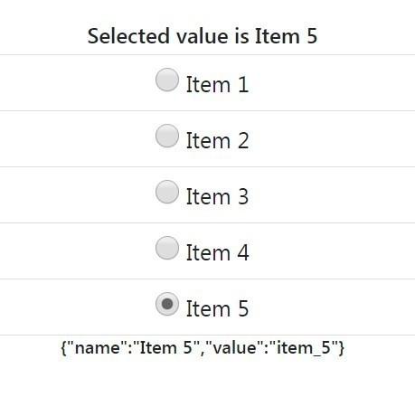
Listing of items in data is a simple way to show items. If users have to select only a single Item out of it, we need to use radio input fields. here we will discuss the implementation of radio input list in Angular 6. We will develop a simple Angular application which will have the following tasks:
1) Create a new Angular Application.
2) item.ts having item model definition.
3) mock-data.ts, will have a list of items.
4) use ngModel to have data binding flowing both sides.
5) Change event binding to get Checked item record.
See the app working here
Also Check: Angular 8/7 | Radio Value Selection and Getting Updated Object in *ngFor Listing Example
Step 1 – Create Angular Application
To begin with, create a new angular application by executing the below ng command. Make sure you have installed the latest ng CLI tool.
$ ng new radioButtonExampleNow, move into the application directory:
$ cd radioButtonExampleStep 2 – Update App Module with FormsModule
To use the forms and their controls with model bindings, we need to import the FormsModule into our App Module. Open the app.module.ts file and update it as shown below.
import { NgModule } from '@angular/core';
import { BrowserModule } from '@angular/platform-browser';
import { AppComponent } from './app.component';

import { FormsModule } from '@angular/forms';

@NgModule({
  declarations: [
    AppComponent
  ],
  imports: [
    BrowserModule,
    FormsModule
  ],
  providers: [],
  bootstrap: [AppComponent]
})
export class AppModule { }
Step 3 – Create Model and Configure the Component Class
For the dynamic list of radio control, we will be having an Object of type Item. Create a new file item.ts with model definition and update it as shown below:
export class Item{
    name:string;
    value:string;
}
After that, create the mock-data.ts file with the JSON object list items which we will iterate to create our Radio list.
import { Item } from './item';

export const ITEMS: Item[] = [
    {
        name:'Item 1',
        value:'item_1'
     },
     {
         name:'Item 2',
         value:'item_2'
      },
      {
          name:'Item 3',
          value:'item_3'
       },
       {
           name:'Item 4',
           value:'item_4'
        },
        {
            name:'Item 5',
            value:'item_5'
         }
];
Next, open the app.compomponent.ts file and replace it with the following code.
import { Component } from '@angular/core';

import {Item} from '../app/item';
import {ITEMS} from '../app/mock-data';

@Component({
  selector: 'app-root',
  templateUrl: './app.component.html',
  styleUrls: ['./app.component.css']
})
export class AppComponent {
  title = 'app';
  radioSel:any;
  radioSelected:string;
  radioSelectedString:string;
  itemsList: Item[] = ITEMS;


    constructor() {
      this.itemsList = ITEMS;
      this.radioSelected = "item_3";
      this.getSelecteditem();
     }

    getSelecteditem(){
      this.radioSel = ITEMS.find(Item => Item.value === this.radioSelected);
      this.radioSelectedString = JSON.stringify(this.radioSel);
    }

    onItemChange(item){
      this.getSelecteditem();
    }

}
Here we have “<strong>onItemChange</strong>” even which will fire on radio selection/change.
“<strong>getSelecteditem</strong>” will find the matching item from dataset ITEMS.
“<strong>radioSelected</strong>” is setting default selection to “item 3”, which will show up selected on app load.
Note: I have added bootstrap.css v4 in index.html at the root for easy styling and also some styles in app.component.css. You can check the source code at the bottom to get the styling details.
Step 4 – Update Template HTML with Radio List
Thereafter, open the app.component.html file and replace HTML with the below content.
<div class="text-center mt-5">
<h4>Selected value is {{radioSel.name}}</h4>

<div>
  <ul class="list-group">
        <li class="list-group-item"  *ngFor="let item of itemsList">
          <input type="radio" [(ngModel)]="radioSelected" name="list_name" value="{{item.value}}" (change)="onItemChange(item)"/>
          {{item.name}}

        </li>
  </ul>
</div>

<h5>{{radioSelectedString}}</h5>

</div>
We are listing out the Radio control using the Angular *ngFor directive by iterating over the itemsList object. The Input Radion element is having a model to get updated values through two-way binding. The (change) event handler will be returning the updated list of selected radio item values.
Step 5 – Run Application
Now, you can run the application by hitting the following ng command at the terminal window:
$ ng serve --openIt will open the application in the browser at the following URL.
http://localhost:4200/Source Code
Find full source code here on Github.
Conclusion
We have completed our tutorial on listing the Radio Items dynamically and fetching the selected value on change event.

