In this Angular tutorial, we’ll discuss how to implement Chart.js library in an Angular 10/9/8/7/6/5/4 project to create graphical interactive charts from data information. There is a wide variety of charts that can be used to represent data in the form of Line, Bar, Doughnut, Radar, Pie, Bubble, Scatter charts, etc.
About Chart.js
Chart.js is a popular charting library and creates several different kinds of charts using canvas on the HTML template. We can easily create simple to advanced charts with static or dynamic data. They provide flexible configuration support to customize charts according to need with color and smooth animation effects. It is known for its simple and beautiful looking charts which are very easy to use.
Chart.js for Angular 2+
In Angular projects, the Chart.js library is used with the ng2-charts package module. It is built to support Angular2+ projects and helps in creating awesome charts in Angular pages. The ng2-charts module provides 8 types of different charts including
- Line Chart
- Bar Chart
- Doughnut Chart
- Radar Chart
- Pie Chart
- Polar Area Chart
- Bubble Chart
- Scatter Chart
On the style side, it also provides builtin Light and Dark themes to use on charts.
Let’s get started with the implementation…
Create an Angular Project
We’ll set up a new Angular project using the Angular CLI tool. Run following npm command
$ ng new angular-chartjs-tutorial
? Would you like to add Angular routing? Yes
? Which stylesheet format would you like to use? CSS
Move to the project directory
$ cd angular-chartjs-tutorialTo show all types of charts, we will create components for each type of chart. Run the ng generate command to create components
$ ng generate component charts/line-chart
$ ng generate component charts/bar-chart
$ ng generate component charts/doughnut-chart
$ ng generate component charts/pie-chart
$ ng generate component charts/bubble-area-chart
$ ng generate component charts/scatter-area-chart
Install and Configure the ng2-charts module in Angular
Now, we will install the ng2-charts package module in the Angular project. As a dependency, we’ll also need to install the chart.js library to provide its method to create charts.
Run following npm command
$ npm install --save ng2-charts
$ npm install --save chart.js
After installation of ChartJs packages, we need to import the ChartsModule in the app.module.ts file.
// app.module.ts
...
...
import { ChartsModule } from 'ng2-charts';

@NgModule({
  declarations: [
    AppComponent,
    ...
    ...
  ],
  imports: [
    BrowserModule,
    AppRoutingModule,
    ChartsModule
  ],
  providers: [],
  bootstrap: [AppComponent]
})
export class AppModule { }
That’s it now we are ready to use CharJS charts in our Angular project.
Before we proceed let’s have a look on properties and options available in ng2-chart module.
Properties of ng2-chart
These properties are used to define or modify chart elements.
data(SingleOrMultiDataSet) – set of points of the chart, it should be MultiDataSet only for line, bar, radar and doughnut, otherwise SingleDataSetdatasets({data: SingleDataSet, label: string}[]) – data see about, the label for the dataset which appears in the legend and tooltipslabels(Label[]) – x-axis labels. It’s necessary for charts: line, bar and radar. And just labels (on hover) for charts: polarArea, pie, and a doughnut. A label is either a single string, or it may be a string[] representing a multi-line label where each array element is on a new line.chartType(ChartType) – indicates the type of charts, it can be: line, bar, radar, pie, polarArea, doughnutoptions(ChartOptions) – chart options (as from Chart.js documentation)colors(Color[]) – data colors will use a default and|or random colors if not specified (see below)<strong>legend</strong>: (boolean = false) – if true show legend below the chart, otherwise not be shown
Events on ng2-chart
chartClick: fires when click on a chart has occurred, returns information regarding active points and labelschartHover: fires when mousemove (hover) on a chart has occurred, returns information regarding active points and labels
Colors on ng2-charts
There are set several default colors. Colors can be replaced using the colors attribute. If there is more data than colors, colors are generated randomly.
Creating Charts using ng2-charts
We can create a ChartJs chart on a template HTML by adding an <canvas> element having baseChart directive with other properties we discussed above. Let’s check how to create different types of charts in the coming sections.
Line Chart Example in Angular using Chart js
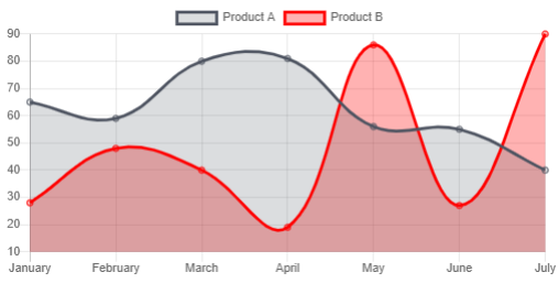
A line chart is the simplest chart type, it shows a graphical line to represent a trend for a dimension. A line graph or chart can have multiple lines to represent multiple dimensions. It is mainly used to display changes in data over time for single or multiple dimensions.
Here we will create a Line Chart example to graphically display the change in the sales of two Products A and B over time.
Open the charts > line-chart > line-chart.component.ts and update with following code
// line-chart.component.ts
import { Component } from '@angular/core';
import { ChartDataSets, ChartOptions } from 'chart.js';
import { Color, Label } from 'ng2-charts';

@Component({
  selector: 'app-line-chart',
  templateUrl: './line-chart.component.html',
  styleUrls: ['./line-chart.component.css']
})
export class LineChartComponent {

  // Array of different segments in chart
  lineChartData: ChartDataSets[] = [
    { data: [65, 59, 80, 81, 56, 55, 40], label: 'Product A' },
    { data: [28, 48, 40, 19, 86, 27, 90], label: 'Product B' }
  ];

  //Labels shown on the x-axis
  lineChartLabels: Label[] = ['January', 'February', 'March', 'April', 'May', 'June', 'July'];

  // Define chart options
  lineChartOptions: ChartOptions = {
    responsive: true
  };

  // Define colors of chart segments
  lineChartColors: Color[] = [

    { // dark grey
      backgroundColor: 'rgba(77,83,96,0.2)',
      borderColor: 'rgba(77,83,96,1)',
    },
    { // red
      backgroundColor: 'rgba(255,0,0,0.3)',
      borderColor: 'red',
    }
  ];

  // Set true to show legends
  lineChartLegend = true;

  // Define type of chart
  lineChartType = 'line';

  lineChartPlugins = [];

  // events
  chartClicked({ event, active }: { event: MouseEvent, active: {}[] }): void {
    console.log(event, active);
  }

  chartHovered({ event, active }: { event: MouseEvent, active: {}[] }): void {
    console.log(event, active);
  }

}
Next, update the charts > line-chart > <strong>line-chart.component.html</strong> file
<div class="chartjs-container">
    <canvas baseChart
        [datasets]="lineChartData"
        [labels]="lineChartLabels"
        [options]="lineChartOptions"
        [colors]="lineChartColors"
        [legend]="lineChartLegend"
        [chartType]="lineChartType"
        [plugins]="lineChartPlugins"
        (chartHover)="chartHovered($event)"
        (chartClick)="chartClicked($event)">
    </canvas>
</div>
This creates a line chart, which will look something like this
How to Refresh Data in Chart JS Angular?
Refreshing data in the ng2-charts is as simple as assigning new values. In the above Line Chart js chart, we can refresh the data by using the lineChartData object as shown below:
  refreshData() {
    this.lineChartData[1].data = [28, 48, 140, 19, 86, 27, 90]
  }
This will simply update the Line chart’s second line plot values to new values. Using this we can redraw the chart, rerender or simply refresh all is that simple.
Making Chart JS Responsive in Angular
In the charts [options] property, we pass the configuration object lineChartOptions. In that, we need to set the responsive property to true. By setting this to true, the chart will occupy its parent containers height and width.
To define the width & height in px, define it on the <canvas> element
<canvas baseChart
      height="300"
      width="500"
      [datasets]="lineChartData">
</canvas>
Pie Chart Example in Angular using Chart js
A pie chart looks like a pie where each slice represents a value. The data in a pie chart is displayed in a circle shape which is divided according to the data passed. A Pie styled chart is mainly used to show values in percentage where each slice depicting each segment percentage relative to other parts in total.
Let’s check how to create a Pie chart using Chart js. We will create a chart showing the composition of Air in percentage.
Open the charts > pie-chart > <strong>pie-chart.component.ts</strong> file and update with following code
// pie-chart.component.ts
import { Component } from '@angular/core';
import { ChartOptions, ChartType } from 'chart.js';
import { Label } from 'ng2-charts';

@Component({
  selector: 'app-pie-chart',
  templateUrl: './pie-chart.component.html',
  styleUrls: ['./pie-chart.component.css']
})
export class PieChartComponent {

  pieChartOptions: ChartOptions = {
    responsive: true,
    legend: {
      position: 'top',
    },
    tooltips: {
      enabled: true,
      mode: 'single',
      callbacks: {
        label: function (tooltipItems, data) {
          return data.datasets[0].data[tooltipItems.index] + ' %';
        }
      }
    },
  };

  pieChartLabels: Label[] = ['Nitrogen', 'Oxygen', 'Argon', 'Carbon dioxide'];

  pieChartData: number[] = [78.09, 20.95, 0.93, 0.03];

  pieChartType: ChartType = 'pie';

  pieChartLegend = true;

  pieChartPlugins = [];

  pieChartColors = [
    {
      backgroundColor: ['rgba(255,0,0,0.3)', 'rgba(0,255,0,0.3)', 'rgba(0,0,255,0.3)'],
    },
  ];
}
Also, update the pie-chart.component.html file
<div class="chartjs-container">
    <canvas
        baseChart
        [data]="pieChartData"
        [labels]="pieChartLabels"
        [chartType]="pieChartType"
        [options]="pieChartOptions"
        [plugins]="pieChartPlugins"
        [colors]="pieChartColors"
        [legend]="pieChartLegend">
    </canvas>
</div>
The Pie chart using ChartJs will look like this
Bar Chart Example in Angular using ng2-charts
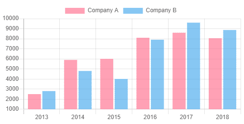
A bar chart is consists of verticle bars that depict the comparison between each other based on information provided. These bars can be aligned vertically as well to form columns.
Here we will create a Bar chart to show the comparison of sales for Company A and Company B between 2013 and 2018 years
Open the charts > bar-chart > <strong>bar-chart.component.ts</strong> file and replace with below code
// bar-chart.component.ts
import { Component } from '@angular/core';
import { ChartDataSets, ChartType, ChartOptions } from 'chart.js';
import { Label } from 'ng2-charts';

@Component({
  selector: 'app-bar-chart',
  templateUrl: './bar-chart.component.html',
  styleUrls: ['./bar-chart.component.css']
})
export class BarChartComponent {

  barChartOptions: ChartOptions = {
    responsive: true,
    scales: { xAxes: [{}], yAxes: [{}] },
  };
  barChartLabels: Label[] = ['2013', '2014', '2015', '2016', '2017', '2018'];
  barChartType: ChartType = 'bar';
  barChartLegend = true;
  barChartPlugins = [];

  barChartData: ChartDataSets[] = [
    { data: [2500, 5900, 6000, 8100, 8600, 8050, 1200], label: 'Company A' },
    { data: [2800, 4800, 4000, 7900, 9600, 8870, 1400], label: 'Company B' }
  ];

}
Then update the bar-chart.component.html file
<div class="chartjs-container">
    <canvas baseChart
        [datasets]="barChartData"
        [labels]="barChartLabels"
        [options]="barChartOptions"
        [plugins]="barChartPlugins"
        [legend]="barChartLegend"
        [chartType]="barChartType">
    </canvas>
</div>
This component will create a Bar chart which will look like this
Doughnut Chart Example in Angular using Chart js
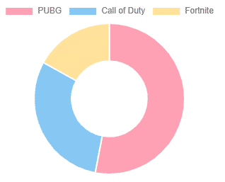
A doughnut chart is a circular chart with a hole inside it. Doughnut chart is used to represent data in the percentage of a part in comparison to all items in total. Using Chartjs we can create a multi-layered doughnut chart with each one inside of the other.
Creating a doughnut chart to representing the percentage of most liked game last years
Open the charts > doughnut-chart > <strong>doughnut-chart.component.ts</strong> and update with following code
// doughnut-chart-component.ts
import { Component } from '@angular/core';
import { Label, MultiDataSet, Color } from 'ng2-charts';
import { ChartType } from 'chart.js';

@Component({
  selector: 'app-doughnut-chart',
  templateUrl: './doughnut-chart.component.html',
  styleUrls: ['./doughnut-chart.component.css']
})
export class DoughnutChartComponent {

  doughnutChartLabels: Label[] = ['PUBG', 'Call of Duty', 'Fortnite'];
  doughnutChartData: MultiDataSet = [
    [53, 30, 17]
  ];
  doughnutChartType: ChartType = 'doughnut';
}
Now update the doughnut-chart.component.html file
<div class="chartjs-container">
    <canvas baseChart
    [data]="doughnutChartData"
    [labels]="doughnutChartLabels"
    [chartType]="doughnutChartType">
    </canvas>
</div>
This will create a Doughnut chart
Bubble Chart Example in Angular using Chart js
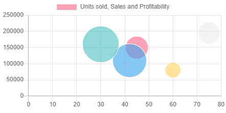
Bubble charts show values in the form of small circles that floats in 3 dimensions. Unlike the line or bar chart, bubble charts are used to represent values in three dimensions. Each item with its triplet of incorporated data is outlined as a disk that represents two of the vi values through the disk’s XY location and the third over its size.
Creating a bubble chart to show Units sold, Sales and Profitability
Open the charts > bubble-chart > <strong>bubble-chart.component.ts</strong> file and update it with below code
// bubble-area-chart.component.ts
import { Component } from '@angular/core';
import { ChartOptions, ChartType, ChartDataSets } from 'chart.js';

@Component({
  selector: 'app-bubble-area-chart',
  templateUrl: './bubble-area-chart.component.html',
  styleUrls: ['./bubble-area-chart.component.css']
})
export class BubbleAreaChartComponent {

  bubbleChartOptions: ChartOptions = {
    responsive: true,
    scales: {
      xAxes: [
        {
          ticks: {
            min: 0,
            max: 80,
          }
        }
      ],
      yAxes: [
        {
          ticks: {
            min: 0,
            max: 250000,
          }
        }
      ]
    }
  };
  bubbleChartType: ChartType = 'bubble';
  bubbleChartLegend = true;

  bubbleChartData: ChartDataSets[] = [
    {
      data: [
        { x: 45, y: 150000, r: 22.22 },
        { x: 42, y: 110000, r: 33.00 },
        { x: 60, y: 80637, r: 15.22 },
        { x: 75, y: 195055, r: 21.50 },
        { x: 30, y: 160446, r: 35.67 },
      ],
      label: 'Units sold, Sales and Profitability'
    },
  ];
}
Update the bubble.chart.component.html file
<div class="chartjs-container">
    <canvas baseChart
        [datasets]="bubbleChartData"
        [options]="bubbleChartOptions"
        [legend]="bubbleChartLegend"
        [chartType]="bubbleChartType">
    </canvas>
</div>
The Bubble chart component in Angular will look like this
Scatter/Dot Chart Example in Angular using Chart js
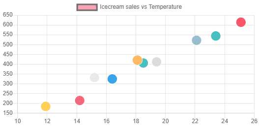
A Scatter plot uses dots to represent individual pieces of data. In statistics, these plots are useful to see if two variables are correlated to each other. A scatter chart is a type of plot or mathematical diagram using Cartesian coordinates to display values for typically two variables for a set of data.
To create a Scatter Dot chart, there is a representation of data related to Icecream sales vs Temperature.
Update the charts > scatter-area-chart > <strong>scatter-area-chart.component.ts</strong> file
// scatter-area-chart.component.ts
import { Component } from '@angular/core';
import { ChartOptions, ChartDataSets, ChartType } from 'chart.js';
import { Label } from 'ng2-charts';

@Component({
  selector: 'app-scatter-area-chart',
  templateUrl: './scatter-area-chart.component.html',
  styleUrls: ['./scatter-area-chart.component.css']
})
export class ScatterAreaChartComponent {

  public scatterChartOptions: ChartOptions = {
    responsive: true,
  };

  public scatterChartData: ChartDataSets[] = [
    {
      data: [
        { x: 14.2, y: 215 },
        { x: 16.4, y: 325 },
        { x: 11.9, y: 185 },
        { x: 15.2, y: 332 },
        { x: 18.5, y: 406 },
        { x: 22.1, y: 522 },
        { x: 19.4, y: 412 },
        { x: 25.1, y: 614 },
        { x: 23.4, y: 544 },
        { x: 18.1, y: 421 },
      ],
      label: 'Icecream sales vs Temperature',
      pointRadius: 10,
    },
  ];
  public scatterChartType: ChartType = 'scatter';

}
In the scatter-area-chart.component.html template replace below code
<div class="chartjs-container">
    <canvas baseChart
        [datasets]="scatterChartData"
        [options]="scatterChartOptions"
        [chartType]="scatterChartType">
    </canvas>
</div>
The Scattered Dot chart will plot like this
Adding All Charts in the App Component
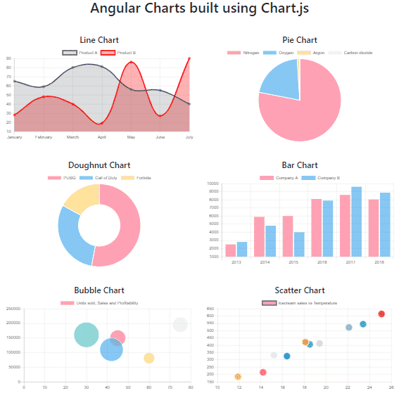
We have created multiple types of Chart components above, now we will add all these charts at one dashboard so that a user can view all these charts at a single glance.
To beautify the Dashboard, just include the bootstrap.css in the <head> section of the index.html file.
<head>
  <!--meta files-->
  <link rel="stylesheet" href="https://stackpath.bootstrapcdn.com/bootstrap/4.4.1/css/bootstrap.min.css">
</head>
Now open the app.component.html file and implement the bootstrap Grid component with rows and columns as shown below
<div class="container text-center">
  <h1>Angular Charts built using Chart.js</h1>

  <div class="row">

    <!-- Line -->
    <div class="col-6">
      <h4>Line Chart</h4>
      <app-line-chart></app-line-chart>
    </div>

    <!-- Pie -->
    <div class="col-6">
      <h4>Pie Chart</h4>
      <app-pie-chart></app-pie-chart>
    </div>

    <!-- Doughnut -->
    <div class="col-6">
      <h4>Doughnut Chart</h4>
      <app-doughnut-chart></app-doughnut-chart>
    </div>

    <!-- Bar -->
    <div class="col-6">
      <h4>Bar Chart</h4>
      <app-bar-chart></app-bar-chart>
    </div>

    <!-- Bubble -->
    <div class="col-6">
      <h4>Bubble Chart</h4>
      <app-bubble-area-chart></app-bubble-area-chart>
    </div>

    <!-- Scatter -->
    <div class="col-6">
      <h4>Scatter Chart</h4>
      <app-scatter-area-chart></app-scatter-area-chart>
    </div>

  </div>

</div>
Finally, we have created a beautiful and cool looking dashboard as well with 6 types of most popular types of Charts using the Chartjs library. These components can be used anywhere as required bypassing dynamic data values using services or @input decorators.
Find source code of this project in GitHub repo
Conclusion: That’s it, we just implemented Chart JS library in our Angular 9/8 project by using the ng2-charts package and created various types of charts like Line, Bar, Pie, Doughnut, etc. We can easily represent simple data into graphical UI charts by using Chartjs. You can get more information in the official Char.js and ng2-charts documentations.

